Prerequisites: Divi 5 (not compatible with Divi 4); access to the Divi 5 Visual Builder.
Managing color at scale is one of those problems that only becomes visible once a site grows past a handful of pages. A primary color gets picked, a few hex values get scattered across module settings, and eventually nothing quite matches — especially after a rebrand. Divi 5 addresses this at the tool level with a generator that derives an entire palette from a single input color and stores every value as a reusable variable. By the end of this guide, you’ll be able to generate a full color system from one base color and apply it as Design Variables across your site.
Step 1: Open the Color Palette Variable Generator
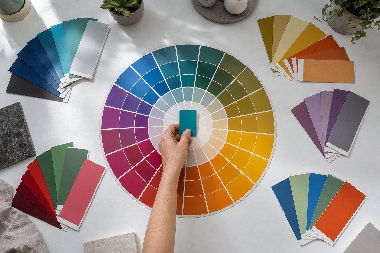
The Color Palette Variable Generator sits inside the Variable Manager in the Divi 5 Visual Builder. Open the Variable Manager from the left sidebar, hover over the Colors group, and click the Generate Color Palette Variables icon. The interface opens as a modal with settings on the left and a live preview on the right — no custom CSS required, and no need to leave the builder. For a full feature overview, see the Elegant Themes documentation.
What separates this from a static color picker is how the output is structured. Divi uses relative HSL (hue, saturation, lightness) adjustments to derive each color from your base, so the relationships between values are mathematically consistent — a generated variable might resolve to something like hsl(210, 80%, 70%) under the hood. The generator can produce several categories of variables from a single starting point:
- Tints
- Lighter variations suited to backgrounds, cards, and subtle accents.
- Shades
- Darker variations for text, borders, and stronger accents.
- Tones
- Reduced-saturation variants that produce calmer UI colors.
- Alpha Variants
- Transparent versions for overlays, shadows, and layered backgrounds.
The generator also derives primary and secondary colors from whichever palette type you select.
All generated values land in the Colors group of the Variable Manager as Design Variables — Divi 5’s system for storing named values, similar in concept to CSS custom properties, that can be referenced across modules and presets. Change the source variable later and anything referencing it updates in place, rather than requiring a manual search through individual module settings.
Step 2: Select a Palette Type
The Palette Type setting controls how the secondary color relates to your primary. Divi offers five harmony models: Complementary (opposite on the color wheel, high contrast), Analogous (adjacent hues, cohesive and calm), Split Complementary (base plus two near-complement colors, contrast without intensity), Triadic (three evenly spaced hues, vibrant and balanced), and Tetradic (two complementary pairs, useful for larger systems but needs restraint). Switching between these in the modal updates the live preview immediately, so you can compare relationships before committing.
Step 3: Adjust Secondary Color and Output Controls
For finer control, the Secondary Color Hue Offset and Secondary Saturation Offset sliders let you nudge the generated secondary color to better match an existing brand asset — useful when a complementary palette is almost right but the secondary color needs to align with a logo color that doesn’t sit exactly opposite on the wheel. Separate count controls for shades, tints, and tones let you decide the depth of each category, and an intensity control adjusts how aggressively each step diverges from the base.
Step 4: Verify Accessibility Before Applying
The Color Style Guide Preview in the right panel lets you evaluate text-on-background combinations before applying any variables site-wide. This is particularly useful for accessibility checks — you can visually evaluate whether light tints appear to carry sufficient contrast for body text before committing to them. The preview does not display WCAG contrast ratios; use the WebAIM Contrast Checker to verify values against WCAG requirements before building presets around those colors.
Step 5: Add Variables to Your Site
Once you’re satisfied with the preview, review it carefully — there’s no bulk undo for variable writes once applied. Clicking Add Variables To My Site triggers a confirmation step, then writes all generated variables into the Colors group. From that point they’re available in every color field in the builder.
Step 6: Apply Variables Inside Element Presets
The practical payoff comes when you assign those Design Variables inside Element Presets and Option Group Presets. Element Presets are per-module saved style sets; Option Group Presets are reusable groups of settings — such as a combined typography and color definition — that apply across multiple module types. By assigning Design Variables to the color fields within these presets, every instance of a module type inherits the color system automatically rather than carrying a one-off hex value. The key workflow benefit is propagation: changing a single Design Variable updates every preset that references it across the entire site, eliminating the manual find-and-replace work that makes color changes costly when values are scattered across individual module settings.