
Managing responsive design values across dozens of modules is one of the more tedious parts of building with a page builder. Divi 5 addresses this with a variable-based sizing system that lets you define typography, spacing, and layout values once — as fluid, clamp()-driven variables — and apply them site-wide. This guide covers how the Variable Generator works and when to customise it, as of Divi 5.
The system is built on Design Variables — a central store for reusable values introduced in Divi 5, separate from per-module settings. They are managed through the Variable Manager, accessible from the left sidebar in the Visual Builder, and available anywhere in the builder. For sizing purposes, these are number-based variables: font sizes, spacing, gaps, widths, border radius, and border widths. Instead of setting padding separately on every section or adjusting font sizes at each breakpoint, you define the value once as a variable and reference it throughout your design.
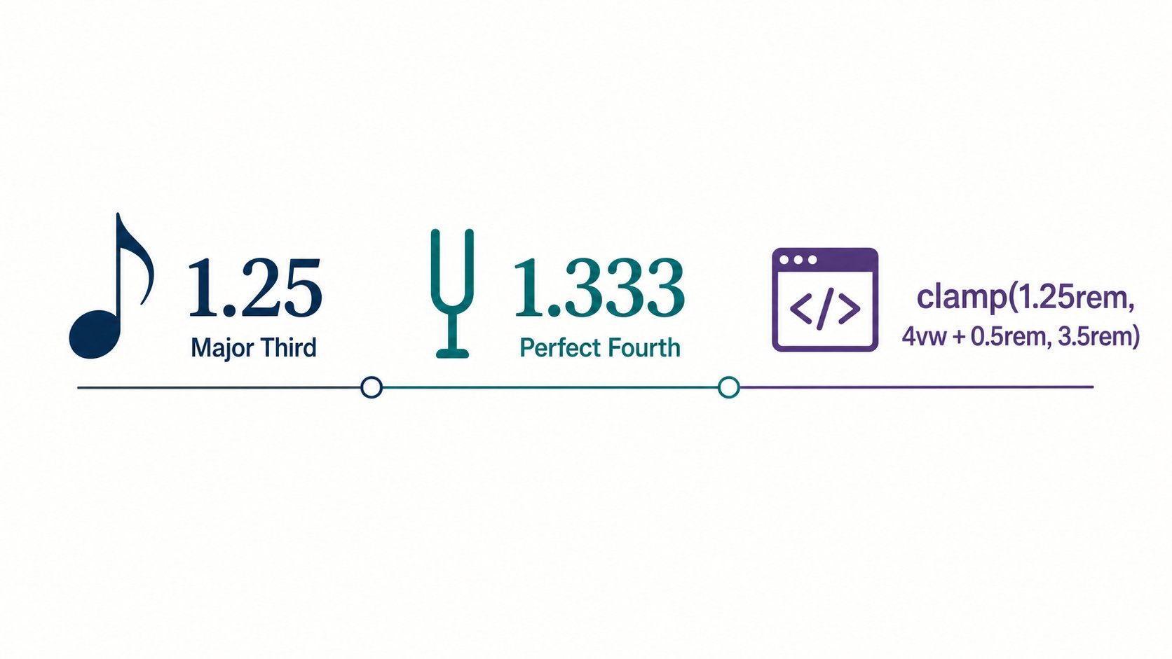
What makes the system genuinely useful is Divi 5’s support for Advanced Units — CSS functions like clamp(), calc(), vw, and rem. These allow values to scale fluidly as the viewport changes, rather than snapping between fixed breakpoint values. clamp() is supported in all modern browsers. A heading styled with a clamp()-based variable scales smoothly from a minimum to maximum size across the full range of screen widths — for example, clamp(1.25rem, 4vw + 0.5rem, 3.5rem) never renders smaller or larger than its outer bounds:
| Argument | Role | In this example |
|---|---|---|
| Minimum size | The smallest the value will ever render, regardless of viewport width | 1.25rem |
| Preferred size | A fluid value, typically in vw units, that scales with the viewport |
4vw + 0.5rem |
| Maximum size | The upper cap the value will never exceed | 3.5rem |
Divi calculates this formula inside the generator. These variables compile to CSS custom properties (e.g. --divi-font-size-md), which means they can also be referenced in custom CSS outside the builder.
To access the generator, open any page in the Visual Builder, click the Variable Manager icon in the left sidebar, then hover over the Numbers group and click the Generate Fluid Sizing Variables icon. The generator opens with configuration controls on one side and a live preview so you can review the full system before committing it to your site.
The Variable Type menu determines what kind of scale you’re building. The available types cover most design needs:
- Font Size — a scalable typography system for headings and body text
- Spacing — reusable margin and padding values
- Gap — horizontal and vertical gap values for flex and grid layouts
- Radius — border-radius values for buttons, cards, and containers
- Border Width — consistent stroke thicknesses for outlines and dividers
- Width — reusable width values for rows, columns, sidebars, and containers
The defaults are suitable for most standard layouts. Back up your site or test on staging before applying changes — both steps below propagate site-wide and aren’t easily undone:
- Select a type, and keep the Scale Type set to Fluid Scale (CSS Clamp).
- Review the live preview to confirm the generated values look right.
- Click Add Variables To My Site, then close the generator.
- Expand the Numbers group to confirm your variables are there.
- Click Save Variables and Apply Changes to publish them to your site.
When you need more control, clicking Customize Values opens the advanced panel. Here you can add extra steps to the scale, edit individual values, and configure modular scaling ratios — typographic proportions like Major Third (1.25) or Perfect Fourth (1.333) — separately for small and large screens. Setting a more restrained ratio for mobile while allowing a more dramatic scale on desktop helps maintain readable visual hierarchy across devices. If your design uses a non-standard content width, configure the Website and Viewport Settings here as well — this ensures Divi generates clamp() values that fit your real layout constraints rather than generic assumptions.
Generating the variables doesn’t apply them anywhere on its own — they still need to be assigned to a setting before they do anything. On any module, click the variable icon next to a relevant field (font size, padding, gap, and so on) to open the Design Variables panel and select the one you just created. Once a setting references a variable instead of a fixed value, it will update automatically whenever that variable changes.
Once your sizing variables are in place, the most effective next step is pairing them with Divi 5 Presets — reusable style configurations that can reference your variables. Any preset built on a variable will automatically reflect changes when you update that variable, making site-wide restyling a matter of editing a small set of values rather than hunting through individual module settings.