Scroll-driven animations have made a genuinely tricky visual effect — columns of content sliding in opposite directions as the page scrolls — achievable without a single line of JavaScript. The technique uses native CSS features available across modern browsers including Chrome, Safari, and Firefox, and it respects prefers-reduced-motion out of the box.
The HTML structure is deliberately minimal. A wrapper .opposing-columns div holds two or more .opposing-column children, each containing .opposing-item cards. Everything else — layout, animation, masking — is handled entirely in CSS.
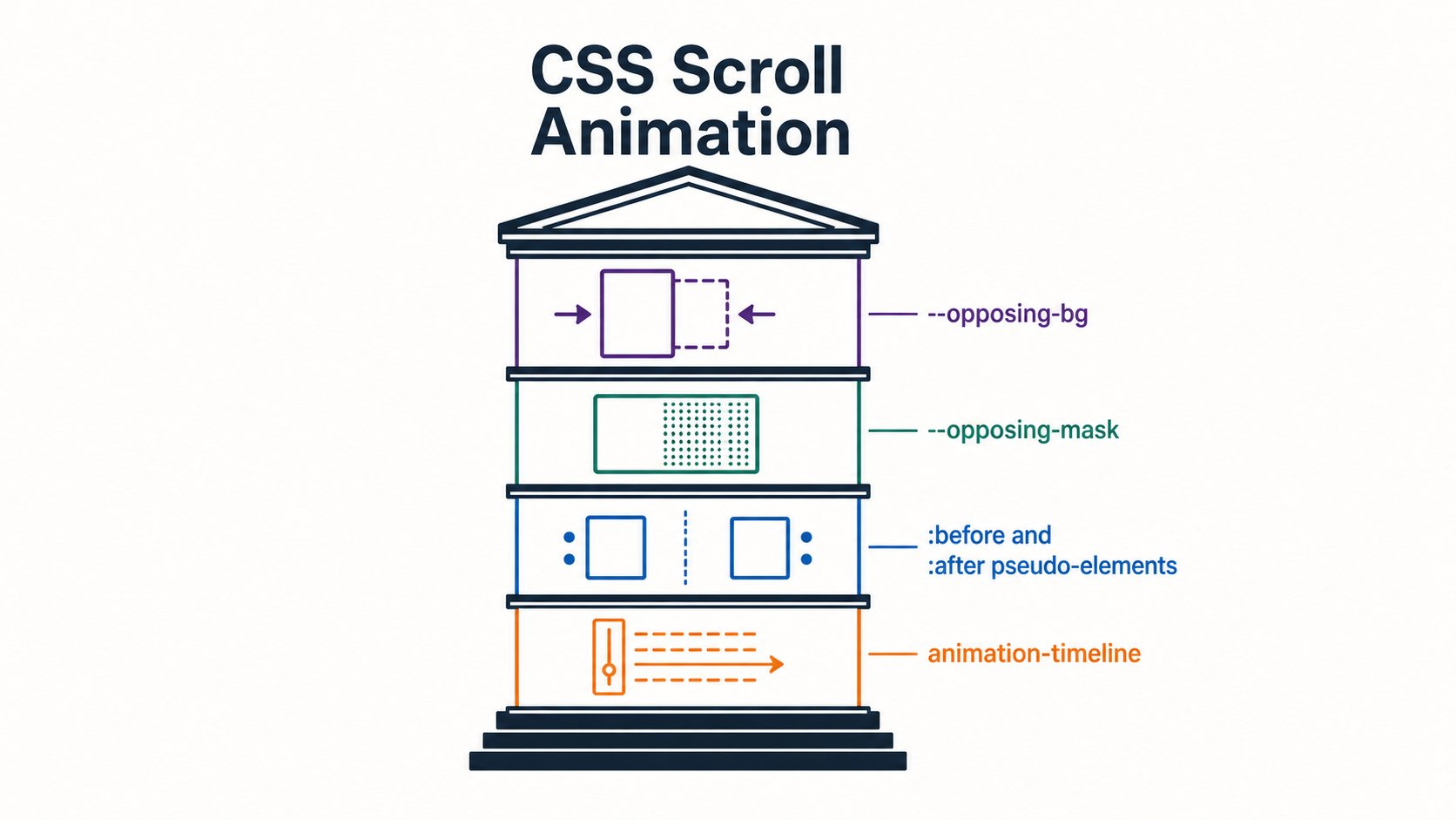
Before adding any animation, the layout needs to be constrained to larger screens and set up with the right stacking context. The parent container uses flexbox for the column layout, and a CSS custom property --opposing-mask controls the vertical breathing room that makes the fade illusion possible. The core setup involves four distinct pieces working together:
--opposing-bg- A custom property set on
:rootthat stores the page background colour, shared between the document and the pseudo-element gradients so they blend seamlessly. --opposing-mask- Controls the height of the fade zone above and below the column container, applied as
margin-blockon the parent and asblock-sizeon the pseudo-elements. :beforeand:afterpseudo-elements- Positioned absolutely on the parent container with
z-index: 1, these sit above the scrolling columns and carry linear gradients that fade items in and out without touching their opacity. animation-timeline- The CSS property that swaps a time-based animation for a scroll-position-based one, making the animation progress tied directly to the element’s movement through the scrollport.
The masking effect is worth understanding clearly. The :before pseudo sits at the top of the parent and carries a gradient running from the solid background colour down to transparent. The :after pseudo mirrors this at the bottom. Column items physically slide under these overlaid gradients, creating the impression they are fading out — no opacity changes needed on the items themselves.
--opposing-bg, --opposing-mask, :before/:after pseudo-elements, and animation-timeline — combine to create a seamless gradient fade illusion without altering item opacity.Each .opposing-column is both a flex item inside the parent and a grid container for its own children. Using flex: 1 1 10rem allows columns to grow and shrink, while switching to display: grid with a gap value spaces the cards cleanly without needing margins.
The animation itself uses the view() function as the value for animation-timeline. Unlike the related scroll() function — which drives an animation based on an element’s scroll position — view() tracks an element’s progress as it enters and exits the scrollport, which is the visible scrollable area of its container. That distinction matters here because the effect depends on knowing when a card crosses the container boundary, not how far down the page the user has scrolled.
Alternate columns get a translateY keyframe animation running in reverse using animation-direction: reverse, which is what produces the opposing movement. One set of columns drifts upward as you scroll, the other downward, both driven by the same view() timeline.
@media screen and (width >= 50rem) {
  .opposing-column {
    flex: 1 1 10rem;
    display: grid;
    animation-timeline: view();
    animation-name: scroll-column;
  }

  .opposing-column:nth-child(even) {
    animation-direction: reverse;
  }
}

@keyframes scroll-column {
  from { transform: translateY(-10%); }
  to   { transform: translateY(10%); }
}

@media (prefers-reduced-motion: no-preference) {
  /* wrap animation declarations in this guard */
}
The whole technique compiles to a small block of CSS with no external dependencies. Wrap the relevant rules in a @media screen and (width >= 50rem) block to keep it off mobile viewports, and add a @media (prefers-reduced-motion: no-preference) guard around the animation declarations for accessibility compliance. The result is a layout effect that would have required a scroll event listener and manual position calculations just a couple of years ago.